As promised in the previous post, A look into Dublin Traceroute results, this time we will see how a graphical representation can highlight things that we wouldn’t normally see immediately.
The diagram in detail
Let’s look again at the graphical traceroute shown in Observing ECMP with Dublin Traceroute:
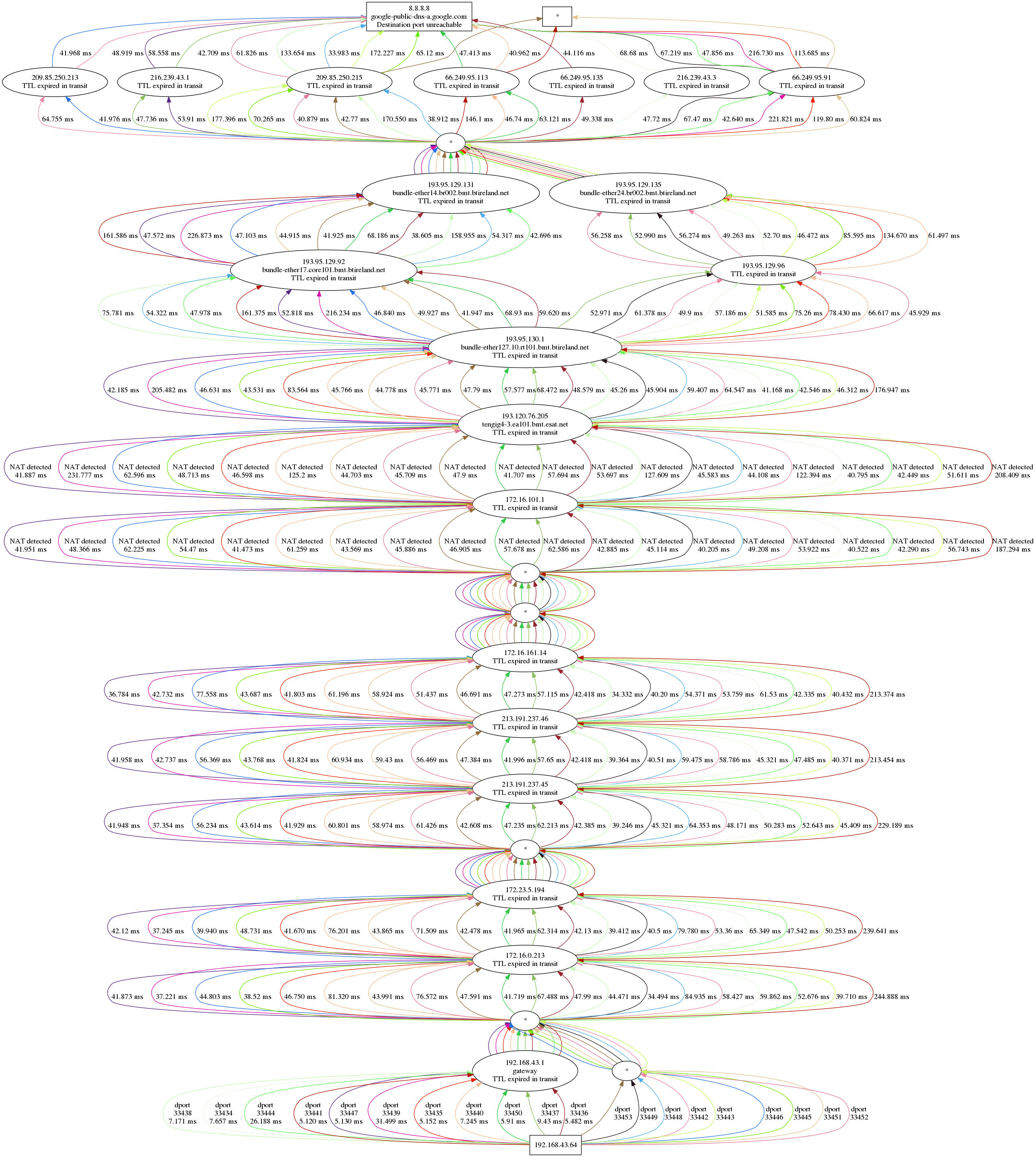
The diagram is quite self-explanatory, but let’s see it in detail anyway.
At the top, the destination (8.8.8.8), at the bottom the source, my laptop (192.168.43.64). In between, a bunch of hops ordered vertically by TTL, and horizontally by path. The traceroute has been initiated from a laptop tethered by a phone with a Three mobile connection.
Many different paths
Each path has a different colour, and this makes it easier to track a path from bottom to top without having to print the destination port for each and every edge.
Each edge shows the latency between the I-th node and the first node. Yes, it’s not the difference between two subsequent hops, as hop-by-hop RTT would make less sense in a traceroute.
Another information we see only on the first set of edges (i.e. between the first and second hops) is the destination port number that identifies the microflow. Dublin Traceroute uses a (configurable) fixed source port and a range of incremental destination ports, so the destination port alone is sufficient to mark a flow.
Unresponsive hops
Whenever a hop is not responsive at a given TTL, an asterisk is shown. For
example, at TTL 1 (between my laptop and 192.168.43.1) there are 9 unresponsive paths.
As discussed in the previous post, this is a consequence of sending packets too fast,
and can be resolved by reducing the packet rate with the command line option --delay.
All the way to the destination
The subsequent hops show the traversal of a bunch of nodes within the Three network, with a mix of RFC1918 and public addresses. However, no address translation occurs along the path.
The first address translation happens somewhere between 172.16.161.14 and 172.16.101.1, and a second address translation just after. This is detected by inspecting the response packets, and correlated to the sent packet thanks to the IP ID, that is set to match the UDP checksum. In a future article I will explain in detail how does the NAT detection work, but for now it’s enough to know that IP ID and UDP checksums are set to the same value, and we detect if address translation has manipulated the checksum (where the IP ID is normally left intact).
Multipath anyone?
A few hops later we see that the packets are traversing two different networks. Note the effect of ECMP in BT’s network: the paths split into multiple directions, to reunite a few hops later, just before Google’s network. I said “reunite”, but we don’t really know how many devices the packets at that TTL are traversing, as there’s no response. We can only guess.
Once reached Google’s network, we notice a wider ECMP spread: 7 devices
(apparently physically different, but that’s not granted). Then finally the
destination, 8.8.8.8, which is anycast, is reached. The returned ICMP is as
expected a Port Unreachable, since we used the traceroute port (33434) and above.
Three packets don’t receive any reply. While this could be an indicator of a
failure on certain network paths, in this case it’s simply a too high packet
rate, which as seen above can be handled with --delay.
Strange things happen
Everything looks right? Not really: there is one path that is showing a strangely high latency up until the boundary between BT’s AS and Google’s AS. The path is marked with the destination port number 33452, and is the rightmost in the diagram.
So graphical traceroutes for the win?
Yes and no. There are still things that can be better seen with a textual representation, e.g. the latency jumps that we would see when traversing MPLS tunnels. My take is that both approaches are useful, and both should be used for troubleshooting, thanks to the different aspects that they highlight.
In addition to that, statistical analysis and different types of charts can highlight even more and different properties. In a future post we will see how to join the data collected by Dublin Traceroute and the power of Pandas for data analysis.
As usual, discussion is welcome :-)
comments powered by Disqus